Roles: Branding Designer, Asset Designer, Communications
Tools: Figma, Adobe Illustrator, Adobe Photoshop
Collaborators: Max Salire, Greta Rose, Kaitlin, Phillip Patterson, Giang Le, Eleanor, Kamy Vu
THE PROJECT
We were tasked to create the visual identity for our program's graduation show. This challenge proved to be interesting as we needed to figure out how to highlight and represent the cohort's (both graphic design and visual media) unique personality and skills! On top of that, there were many other teams that relied on the branding team to provide the visual identity as soon as possible in this 3-month project.
THE THEME
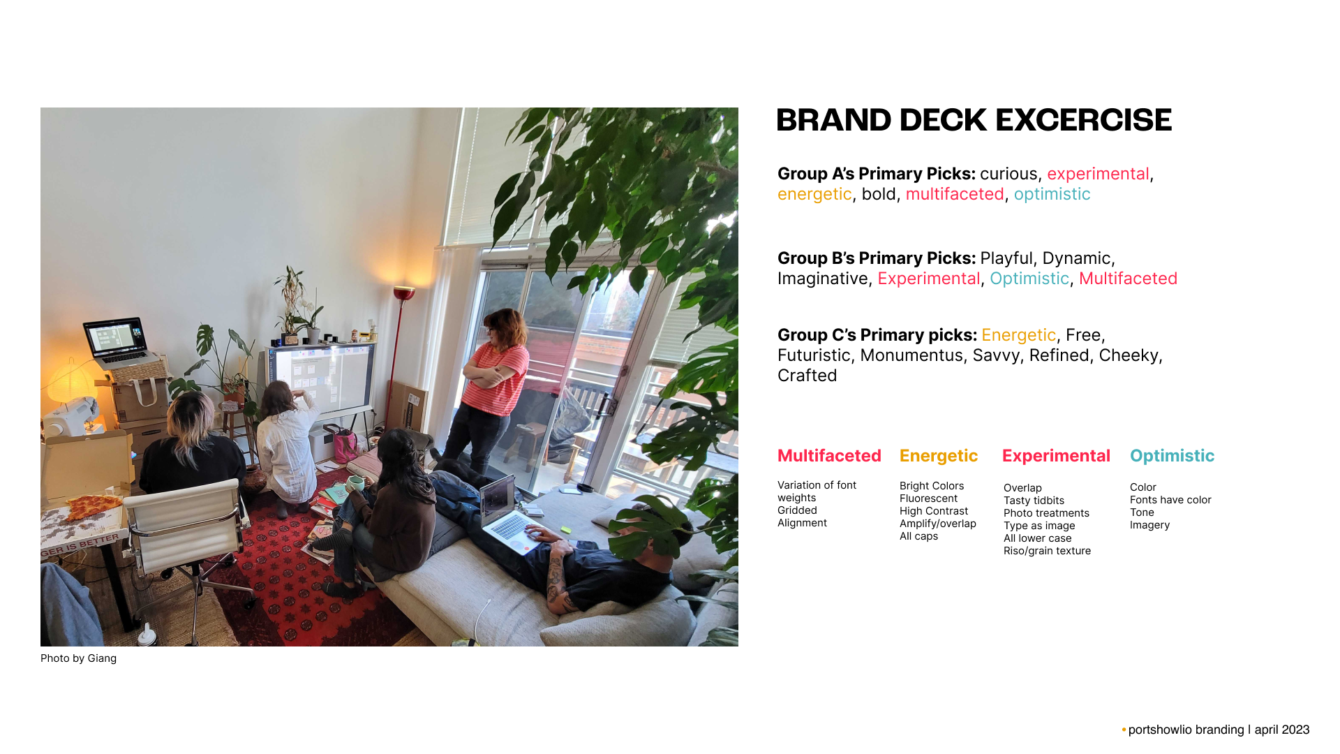
Our theme, was decided in the previous quarter through vote. Starting early, we gathered to discuss and breakdown the chose theme to nail down what we want to represent through the brand deck exercise. We settled on: Multi-faceted, Energetic, Experimental and Optimistic
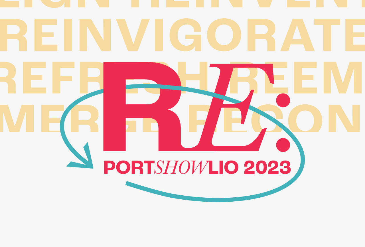
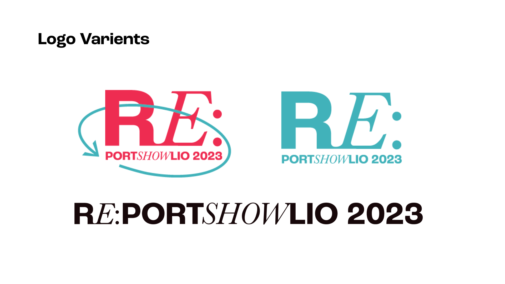
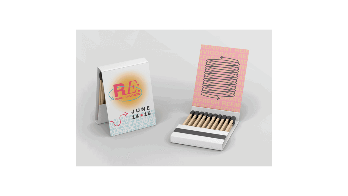
RE: is a prefix, occurring originally in Latin, used with the meaning “again” or “again and again” to indicate repetition, or to specify motion. This definition of RE: resonates visually with the class of 2023’s energetic, experimental and optimistic nature. It can be paired with different words like emerge, invent or new to represent out multi-faceted cohort. With this forward thinking approach to the theme we can exhibit our capabilities while simultaneously establishing a cohesive and authentic visual direction.
THE PROCESS
After developing the theme and our goals further we started to make some essential decisions on visual identity. This was tricky since, 1. our branding team was large and we wanted to make sure everyone's voices were heard and 2. we had to make decisions quickly and decisively as we rolled out the rules to the rest of the cohort. Our approach to this was to decide and share the very essentials, such as mood boards, type and color, at the very beginning.
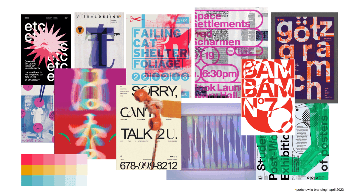
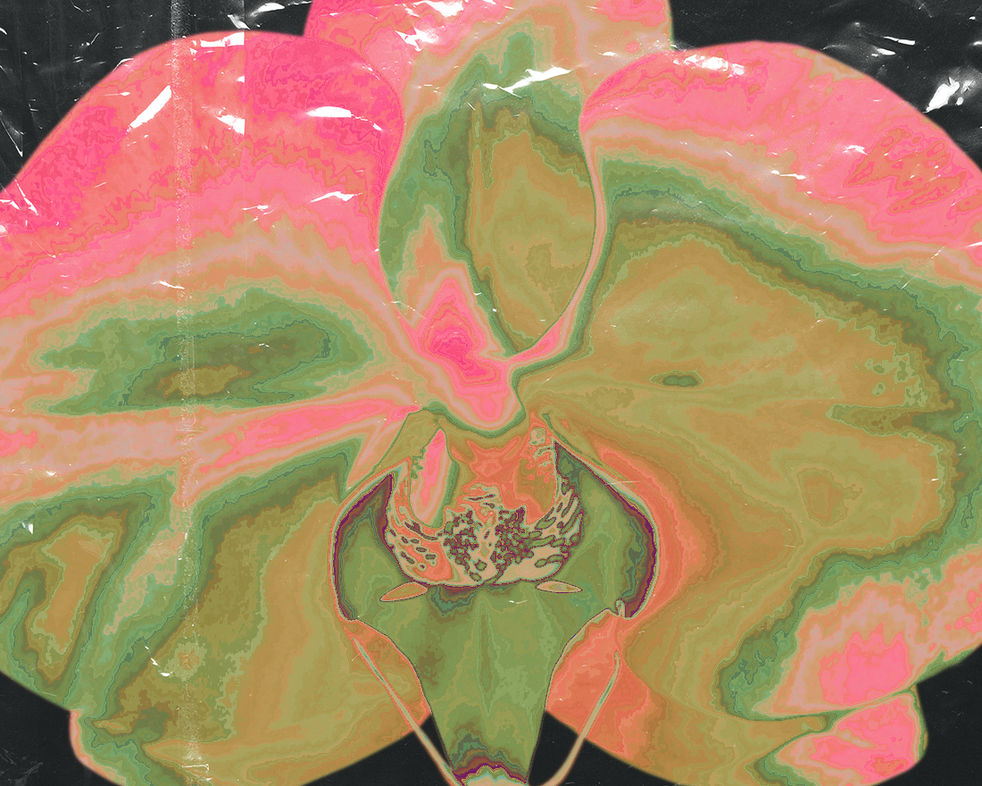
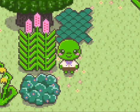
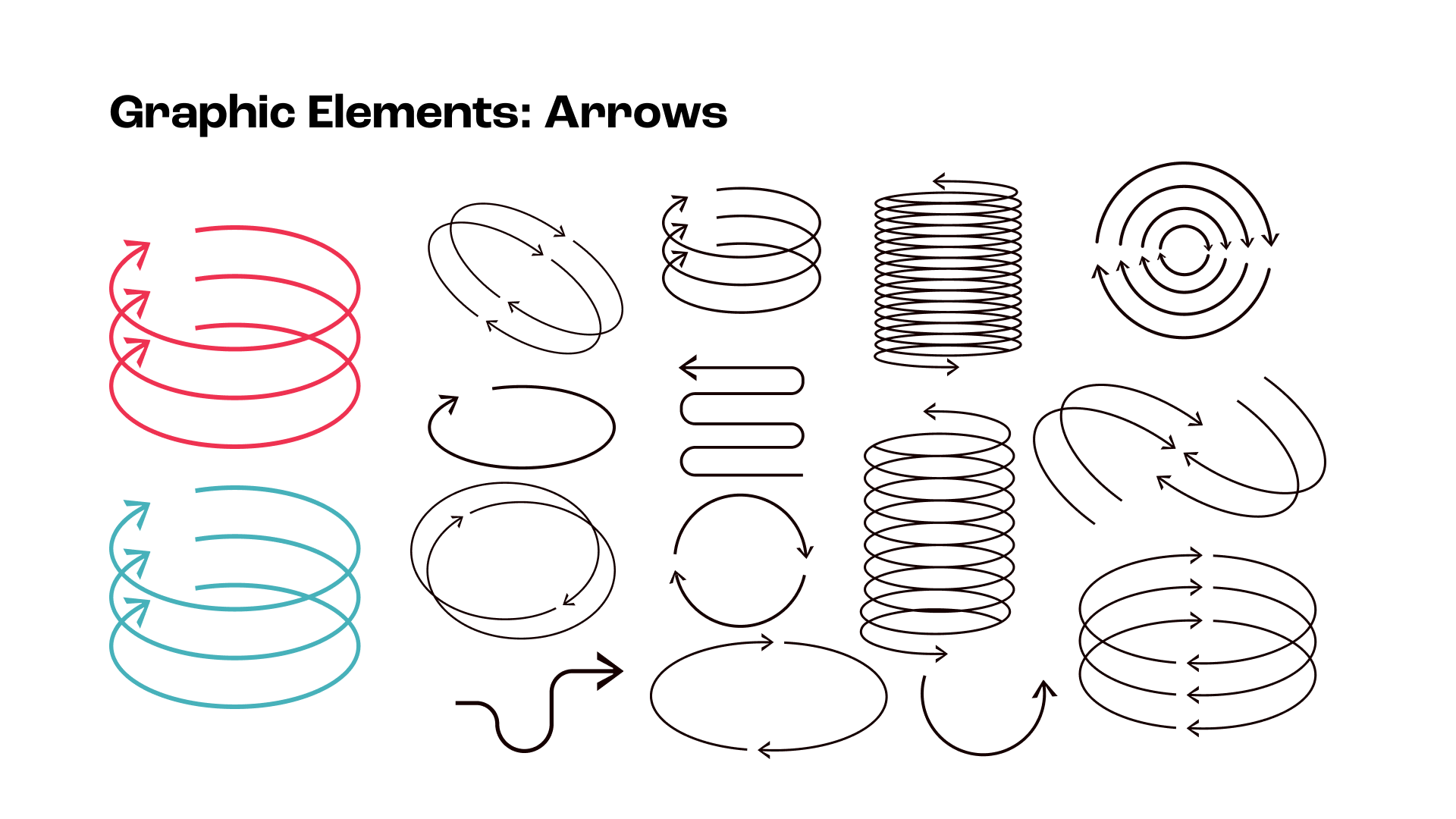
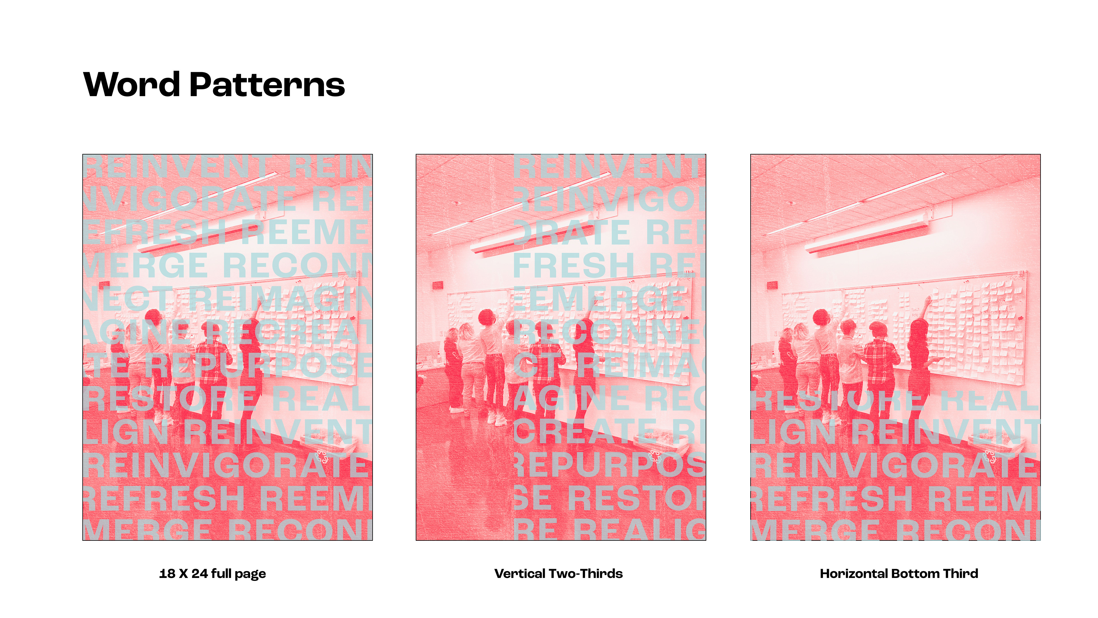
Using the color and type rules we set, as well as the mood boards for reference, for the next couple of weeks we experimented greatly on the visual direction of the graphic elements and visual style. Each of us created posters and proposed different directions we could take! Through the weeks we discussed and riffed off each others ideas. Here are some of the examples of posters we did during this process.
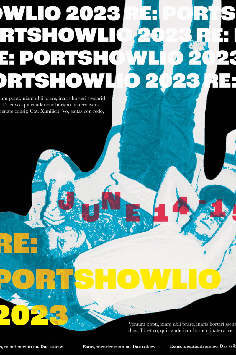
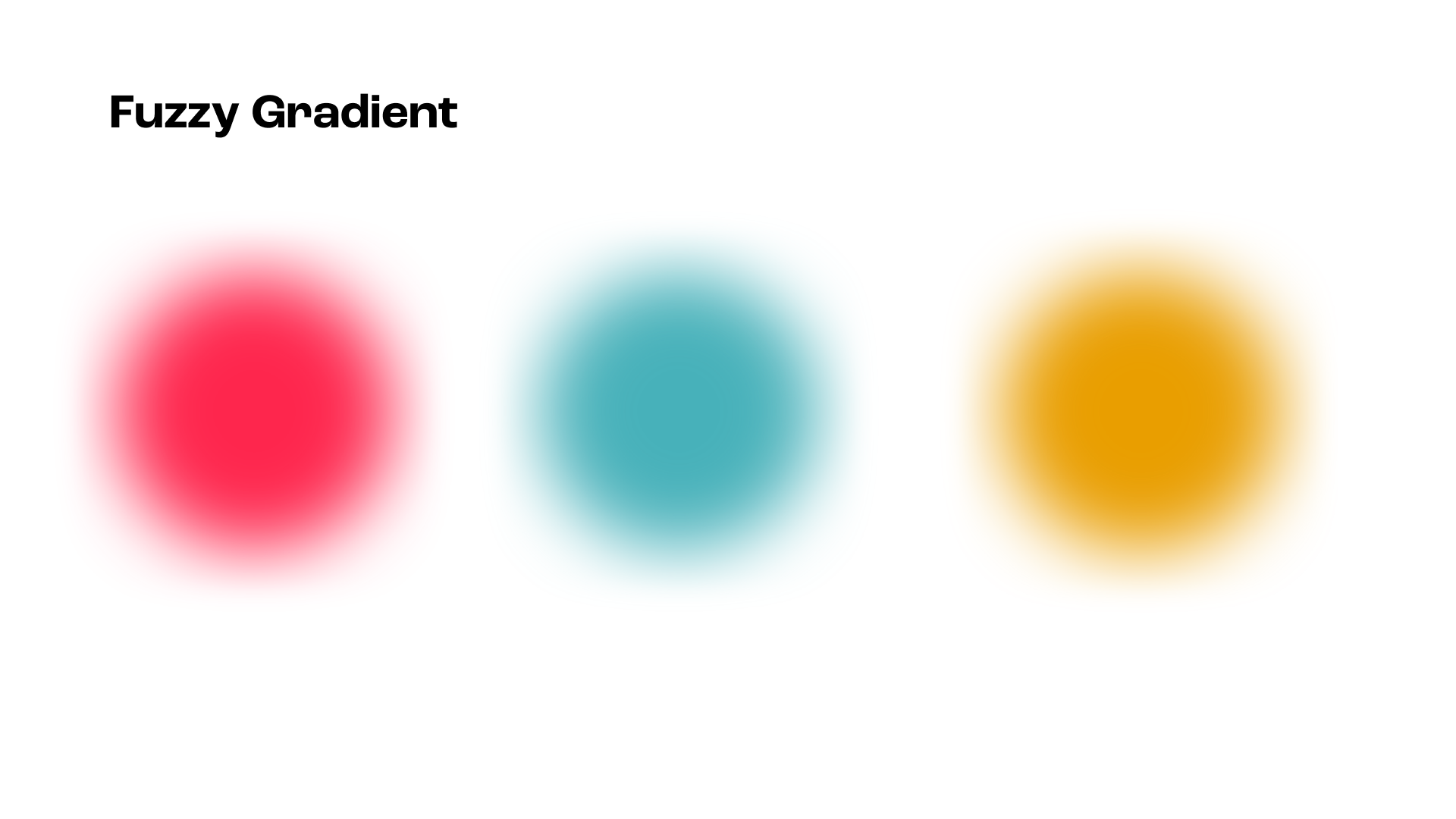
This method was unique and efficient. Through our countless versions and experiments we were able to make some very important decisions. We ended up settling on our logo, graphic elements, textures and photo treatments.
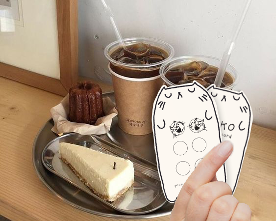
To decide on rules and ensure that our visual identity was consistent, we created mockups of different deliverables including social media posts, invites and stickers.
STYLE GUIDE
With everything decided and refined, we were able to roll out our full style guide and a shared file of all the assets we created to the rest of the cohort! Check it out.
FINAL THOUGHTS
Working in a large group with a very short deadline was tough and grueling, but one of the most important and satisfying projects I did in my time in school. I had so much fun working with such talented individuals who pushed each other to create something the entire cohort felt represented by and was proud of! Huge props to everyone involved. I truly believe that this project cemented my confidence in myself as a designer and a team player.
Please check out 2023.portshowl.io to see my other classmates and the amazing work of the web design team!